


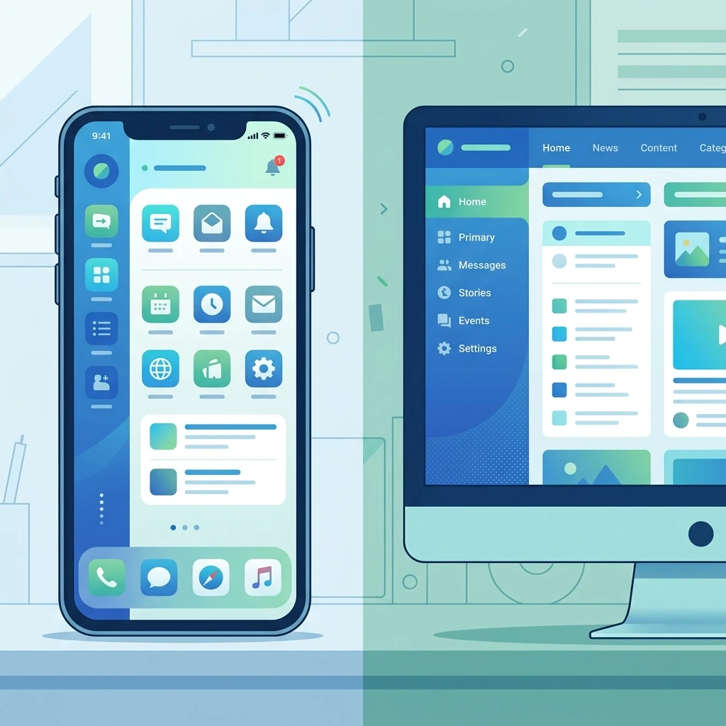
A website that looks stunning on a large desktop monitor can sometimes turn into a jumbled mess on a smartphone screen. Elements overlap, text becomes unreadable, and navigation buttons shrink down to microscopic sizes. When users encounter these visual errors, they rarely stick around to figure them out. They simply leave.
Creating a seamless browsing experience across all screen sizes is no longer just a nice bonus for your visitors. Search engines actively penalize websites that fail to provide a fluid, functional layout for mobile users. If your pages require constant pinching, zooming, or horizontal scrolling, you risk losing both valuable traffic and potential revenue.
Identifying the root cause of these visual bugs is the first step toward building a better user interface. This comprehensive guide will walk you through the most effective ways to troubleshoot your layout, optimize your code, and implement a website mobile desktop display issues fix so your site performs flawlessly on any device.
Comprehensive Responsive Website Troubleshooting Guide

When your layout breaks, the problem usually stems from how your website handles scaling. Responsive design relies on specific rules to adapt content to the user’s screen. If those rules are missing or poorly configured, display issues follow.
Fix Responsive Design Issues on Website
The foundation of any responsive site is the viewport meta tag. Without it, mobile browsers will try to render your page at a desktop width and scale it down, resulting in tiny text and unclickable links. Ensure your HTML document includes this tag in the <head> section:
<meta name="viewport" content="width=device-width, initial-scale=1">
Once the viewport is set, review your media queries. These CSS rules apply different styles based on screen width breakpoints. A common mistake is hardcoding fixed widths (like width: 800px) instead of using relative units (like width: 100% or max-width: 800px). Switching to relative units allows your content containers to shrink naturally as the screen gets smaller.
Fix CSS Display Issues for Mobile and Desktop
Legacy CSS layout methods, such as floats and rigid margins, are notorious for causing cross-device layout problems. Modern CSS layout modules offer a much more reliable solution.
Flexbox is incredibly useful for aligning items in rows or columns and distributing space dynamically. CSS Grid provides a two-dimensional layout system that allows you to define complex grid structures that rearrange themselves based on the viewport. Updating your CSS to use Flexbox and Grid will immediately resolve many overlapping elements and awkward spacing issues.
Resolve Website Layout Breaking Issues
Layout breaks often happen when a specific element is too wide for its container. Long URLs, unbroken strings of text, or fixed-width tables can force a page to scroll horizontally. You can prevent text from breaking your layout by applying the word-wrap: break-word property to your CSS. For tables, consider wrapping them in a container with overflow-x: auto so users can scroll the table itself without scrolling the entire page horizontally.
Cross-Device Compatibility Issues Fix

Different browsers, operating systems, and devices often interpret the same code in slightly different ways, which can lead to unexpected layout shifts, broken elements, or inconsistent styling across screens. For example, a design that appears perfectly aligned on an iPhone using Safari may look misaligned or completely different on an Android device running Chrome or another browser. These inconsistencies are one of the most common challenges when working on a Cross-Device Compatibility Issues Fix.
To properly achieve a Cross-Device Compatibility Issues Fix, it’s important to use standardized, modern coding practices such as responsive CSS frameworks, consistent font rendering, and cross-browser testing tools. Regularly testing your website on multiple devices and browsers helps you identify issues early and ensures that your layout, typography, and functionality remain consistent everywhere. This approach not only improves user experience but also ensures your website performs reliably across all platforms.
Website Not Displaying Properly on Mobile Devices
If your site fails on mobile, check your touch targets. Buttons and links must be large enough to be easily tapped with a finger. The standard recommendation is a minimum touch target size of 48×48 pixels.
Images also play a major role in mobile display issues. Large, fixed-width images will break out of their containers and ruin your layout. Always use the following CSS rule to ensure images scale down properly:
img { max-width: 100%; height: auto; }
Website UI Issues on Different Screen Sizes
Navigation menus often cause headaches on smaller screens. A horizontal menu with five links might fit beautifully on a desktop, but it will crowd a mobile screen. Implementing a mobile-friendly “hamburger” menu or an off-canvas navigation panel keeps the user interface clean and accessible on phones and tablets.
Additionally, review your padding and margins. Generous whitespace looks great on a desktop monitor but consumes valuable real estate on a phone. Use media queries to reduce padding on smaller screens, keeping your content prominent and easy to read.
Mobile and Desktop Layout Problems Solution
Fixing mobile and desktop layout issues requires continuous testing, optimization, and a strong understanding of responsive design principles. A proper Mobile and Desktop Layout Problems Solution ensures your website adapts smoothly to different screen sizes, browsers, and devices without breaking the user experience. Instead of waiting for users to report issues, you should proactively test how your site behaves across various environments to catch layout shifts, alignment problems, or scaling errors early.
Improve Website Responsiveness Across Devices
Mobile-Friendly Website Optimization Tips
Speed is one of the most important factors in creating a smooth mobile experience, and a responsive layout alone is not enough if your site loads slowly. A strong Mobile-Friendly Website Optimization Tips strategy focuses on improving both performance and usability so users can access content quickly without delays or frustration.
To improve performance, start by compressing images without losing quality, minifying CSS and JavaScript files, and removing unnecessary code that slows down rendering. Implementing lazy loading is also essential, as it ensures images and videos only load when they appear in the user’s viewport. This reduces initial page load time, improves overall speed, and saves mobile data usage. By applying these techniques consistently, you can significantly enhance mobile performance and deliver a faster, more efficient browsing experience.
FAQs
To help you troubleshoot faster, here are 15 frequently asked questions surrounding a website mobile desktop display issues fix.
What is the most common cause of website mobile desktop display issues?
The most frequent cause is using fixed widths (like pixels) instead of relative units (like percentages) for layout containers and images.
How do I apply a website mobile desktop display issues fix for images?
Add max-width: 100%; height: auto; to your image CSS to ensure they scale down to fit smaller screens without stretching.
Why is my website forcing horizontal scrolling on mobile?
This usually happens when an element, such as a large image, a long unbroken word, or a fixed-width container, is wider than the mobile viewport.
What is a viewport meta tag?
It is an HTML tag that tells the browser how to control the page’s dimensions and scaling. It is essential for a website mobile desktop display issues fix.
How do media queries help fix display issues?
Media queries allow you to apply specific CSS rules based on the size of the user’s screen, enabling you to change layouts from desktop to mobile seamlessly.
Why does my navigation menu look broken on mobile?
Desktop navigation bars often lack the space to display horizontally on mobile. You should fix this by implementing a collapsible or dropdown mobile menu.
How can I test my website mobile desktop display issues fix?
Use the responsive design mode in your browser’s developer tools, or use real-device testing software to see how your site renders on various screens.
What role does Flexbox play in responsive design?
Flexbox allows containers to expand or shrink dynamically to fill available space, making it much easier to align elements across different screen sizes.
Can caching cause display issues?
Yes. If you push a website mobile desktop display issues fix to your CSS, users might still see the broken layout if their browser has cached the old stylesheet. Always clear your cache when testing.
Why is my text too small to read on mobile devices?
This happens when the viewport tag is missing, causing the mobile browser to render the desktop version and scale it down to fit the screen.
How do I fix overlapping text on small screens?
Check your CSS line-height and margin settings. Also, ensure you aren’t using absolute positioning, which can cause elements to crash into one another when the screen shrinks.
Are tables bad for mobile display?
Traditional HTML tables are rigid and often break mobile layouts. You can fix this by wrapping the table in a container with overflow-x: auto to allow horizontal scrolling just for the table.
What is a touch target error?
This occurs when buttons or links are too small or placed too close together on a touch screen, making it difficult for mobile users to tap the correct link.
Should I create a separate mobile website?
Responsive web design is generally preferred over maintaining a separate “m.website.com” domain, as it keeps your SEO efforts centralized and is easier to maintain.
How does page speed impact mobile display?
If a site loads slowly on a mobile network, the CSS might render late, causing a brief flash of unstyled content or a broken layout before the page fully loads.
Next Steps for a Flawless Cross-Device Experience
Fixing layout bugs requires patience, consistent testing, and a solid understanding of modern CSS practices. To successfully learn How to Fix Website Mobile and Desktop Display Issues, you need to go beyond quick fixes and focus on building a flexible, responsive foundation. This includes using fluid grids, optimizing media queries for different breakpoints, and ensuring all elements—images, text, and buttons—adapt smoothly across screen sizes. Prioritizing touch-friendly interfaces, readable typography, and proper spacing will also improve usability on smaller devices.
Start by auditing your website on real mobile devices as well as desktop screens. Identify problem areas such as overlapping elements, slow-loading sections, or navigation issues, and address them step by step. Regular cross-browser and cross-device testing will help you catch inconsistencies early. By consistently applying these strategies, you can confidently master How to Fix Website Mobile and Desktop Display Issues and deliver a seamless, professional experience that keeps users engaged on any device.


")


